Whilst on furlough I have decided to use my spare time in sorting out my website by transitioning it away from WordPress to HTML and CSS. To keep my skills up I started the Build a Responsive Website with a Modern Flat Design on Udemy. The course was only a couple of hours and it didn’t teach me anything new apart from introducing me to Foundation but it was perfect to ignite my create spark and sort out my personal website. About half way through the course I decided to rework what had been done and copy my existing WordPress website and code it into HTML and CSS.
-
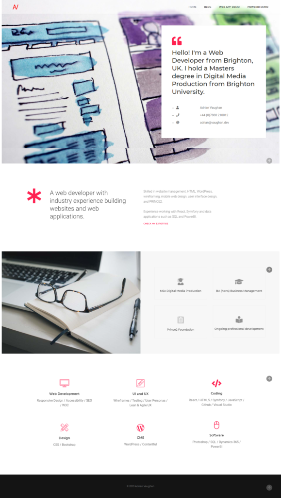
The original site created using Pofo theme
-
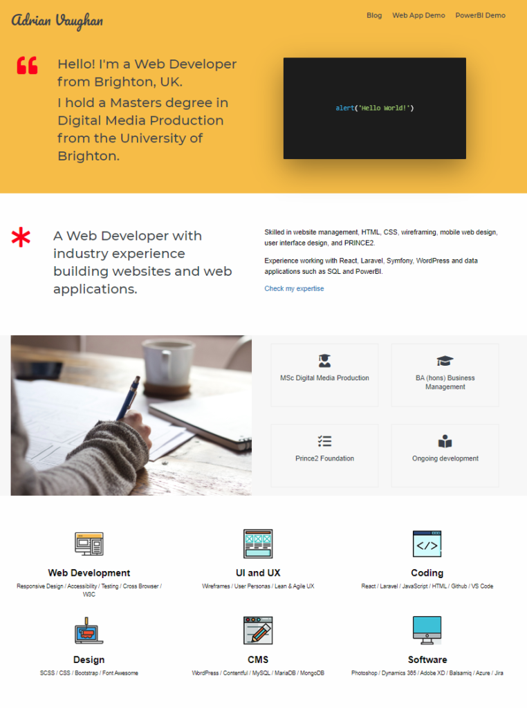
New website coded in HTML and CSS
My original WordPress website used the Pofo agency theme which had Parallax scrolling on the top page content as well as animation on the education image and float up on the expertise icons.
I quite liked the layout as it as an introduction at the top with my contact details, followed by a little selling point which preceding my education and qualifications and finally finishing with my skill set which was grouped in to six categories.
The Udemy course website was pretty much structured in the same way so I used that as a starting point. For my minimum viable product the website would have the same sections with animations and sticky header to be added at a later date.
On top of using Foundation as the framework the website utilises Google Fonts and Font Awesome for the icons. The expertise images are from PNG Repo and used under the Create Commons 4.0 licence.
The hover over reveal on the education and qualifications selection proved tricky, it worked well on Chrome, Firefox and Edge but on Apple devices it would not work. I managed to find the following fix on Stack Overflow:
<script>
  document.addEventListener
  ("touchstart", function () {}, false);
</script>
For the top section area the Udemy course used a PNG of a laptop on the right, I felt that this was a bit boring and decided to place my contact details there instead in the dform of a busnes card.
I found a nice business card by Laura Pinto on Codepen which had the contact details listed in JavaScript. I had to tweak the code from SCSS and adapt it for my website but when testing it didn’t work on iOS devices. Looking once again at Stack Overflow the solution was to add the webkit transform to the CSS element:
-webkit-transform: translateZ(0);
-moz-transform: translateZ(0);
-ms-transform: translateZ(0);
-o-transform: translateZ(0);
transform: translateZ(0);
It works on Edge but it has a bug and I have left it as is, on Internet Explorer the card spins around, which will give anyone still using IE a little ray of sunshine into their otherwise dull life.
This was a good start to building my website, in the future I will add a portfolio section as the second phase but this is a nice MVP, the site is nicely responsive and works well on mobile devices.